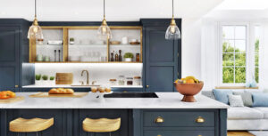
I’m going to preface this by saying that yes, I do like Upward SW6239. It’s a beautiful color, and I would definitely use it in my own home or for a clients. It’s light and refreshing but has a neutral earthiness to it. However, I don’t think it’s the right choice for the Sherwin Williams color of 2024.
Upward is the type of color that I would have recommended to anyone looking for a cool neutral in 2015 when people were starting to move away from gray but didn’t want to stray so far that they would have to completely redecorate. It’s a beautiful choice, but a safe one.
Fast forwarding 9 years, color has become desirable again. Over the last few years, we’ve seen rich greens, deep terracottas, mysterious deep blues, and vibrant raspberry. I was disappointed in 2023 by Behr with their ultra-safe choice, Blank Canvas, and that is how Upward is making me feel this year.
According to Sherwin Williams, as told to Martha Stewart, the design world is shifting away from warm tones to cooler neutrals as part of a coastal trend. I disagree that we are there yet. We will get there again, eventually. I do think that Upward can be part of a beautiful dramatic color scheme with navy or a gorgeous brown, but I don’t think it’s ready to stand on its own yet.
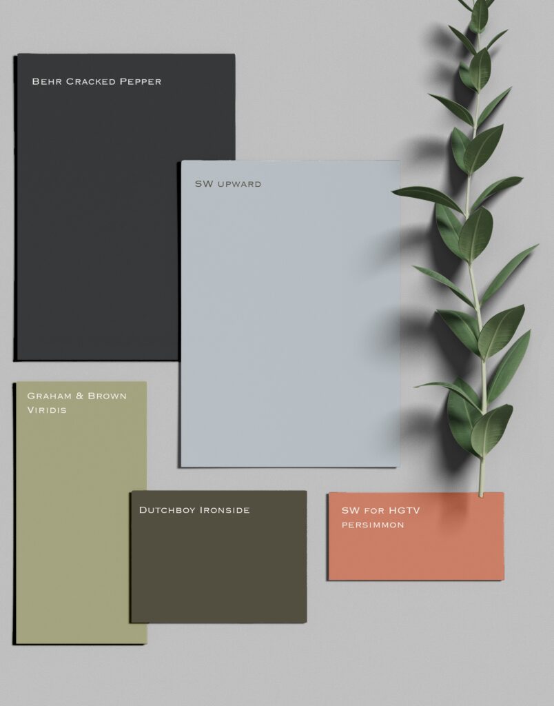
As for the other paint companies, so far, so good. Behr has redeemed itself in my eyes with Cracked Pepper, a neutral charcoal that will create a dramatic background. Graham and Brown have selected Viridis, a beautiful light olive green that can stand on its own or as a team member. Dutch Boy has chosen Ironside, which so far is my unexpected favorite. Finally, as part of the HGTV palette, Sherwin Williams has chosen Persimmon, which is a beautiful warm earthy apricot color and one I think fits perfectly into the 2024 palette.
There are not many other paint companies I am waiting on at the moment. Farrow & Ball doesn’t do a yearly color forecast, although they did just introduce the stunning new collection Carte Blanche. But I am waiting on Benjamin Moore. Last year they selected Raspberry Blush, a beautiful deep coral color that fit perfectly with the Tomato Girl Summer micro-trend. I can’t wait to see if they hit it out of the park again this year.