Last week, I found myself helping a friend choose a paint color for her new apartment—over FaceTime, no less, while she was in Home Depot. Not the ideal setup, and I definitely wouldn’t recommend it! But she had just gotten the keys and was moving in the next day, so time was of the essence. Thankfully, we made a great choice, and she was thrilled with the color. However, she mentioned, “Deciding on the color was so hard, and I still don’t know how to decorate the room.” I reminded her—that’s why people hire professionals like me.
This conversation got me thinking about how someone without a design background might approach decorating a room. While every designer has their own special sauce, there are some general guidelines that anyone can follow to get started.
For this friend, I suggested beginning with a color palette of 3-5 colors. This begs the question: How do you figure out your color palette?
Accept What You Will Not Change: Look at the details that are already in place and aren’t going to change, such as flooring, moldings, and any furniture you plan to keep in the space.
Collect Inspiration: Some people love using Pinterest to gather ideas, but if that’s not your thing, try taking screenshots of things you like. Create a folder on your phone or computer, and save images that catch your eye—not just home decor, but anything that inspires you. You’ll likely start to notice a pattern of colors emerging.
Consider the Mood: Ask yourself, “What do I want this room to feel like?” If the goal is calm, tranquility, or zen, stick with low-key, subdued colors, and steer clear of anything too bright, as those tend to energize rather than soothe.
Pick 4 or 5 Colors: Using the inspiration you’ve gathered, narrow down your choices to 3 to 5 colors. Typically, this will include a couple of neutral background colors, a couple of stronger statement colors, and one pop of color.
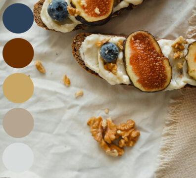
Any photo can be the basis of a color palette, once you start to see a color pattern in your inspo photos you are ready to create your palette.
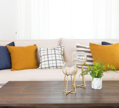
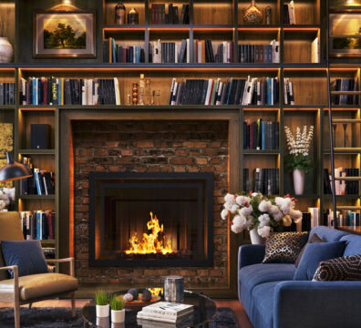
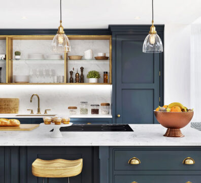
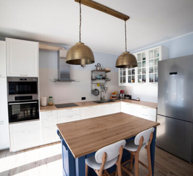
Deciding how to apply the colors can be a little tricky. These rooms have the same basic color palette but they are all applied differently. Using the darker colors as the base will create a room rich with drama whereas a room where the lighter, more neutral tones are prevalent will create a serene and airy atmosphere. The way you balance these tones can completely transform the feel of the space, making it either bold and striking or calm and inviting.
There are also some great apps to help you refine your color palette:
Coolors: This is one of the best tools for selecting a color palette. You can easily pick colors from a photo on your phone. The app preselects 5 colors, but you can tweak them to find what works best. You can also browse thousands of color palettes created by other users.
Pantone: Similar to Coolors, the Pantone app lets you select colors from a photo or explore preselected palettes.
Canva: Canva has a quick and easy tool to extract colors from your photos. However, you can’t manually choose the colors—it does that for you.
Once you’ve settled on your base colors, your statement colors, and your pop color, you can move on to the next step: applying these colors in your space. I’ll dive into that in our next blog post.
Join us in our journey of creativity at Hive Interior Studio! We bring you a glimpse into the design world, from brainstorming new design concepts and creating 3D renderings, to exploring trends and other design news. Please stay, get comfortable and be inspired by our blog.