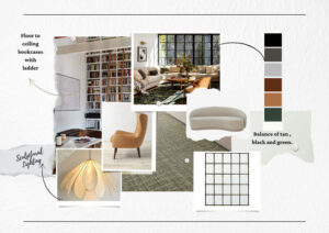

Gray Owl
BM OC-52

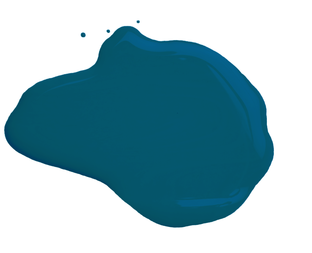
Nightengale
BM AF-670

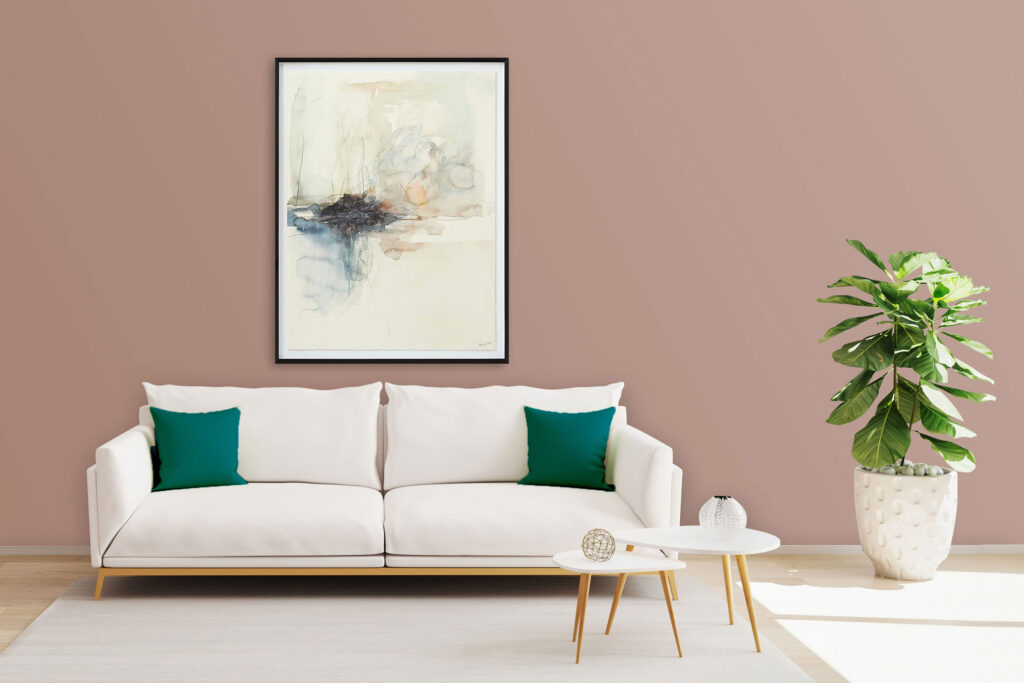
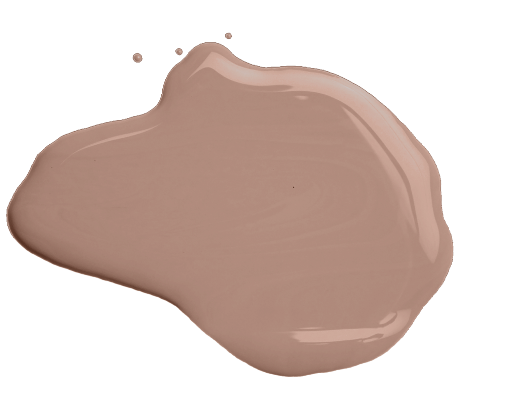
Persimmon
BM 2088-40
Cool Beige
SW 9086

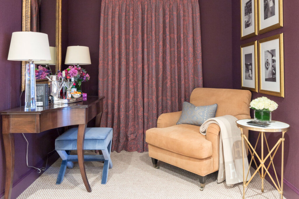
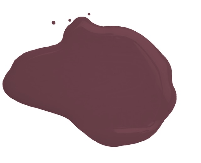
Polished Mahogany
SW 2838

Pure White
SW 7005

Blank Canvas
DC-003

Desert Springs
PPU10-15

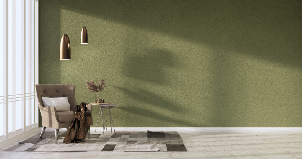
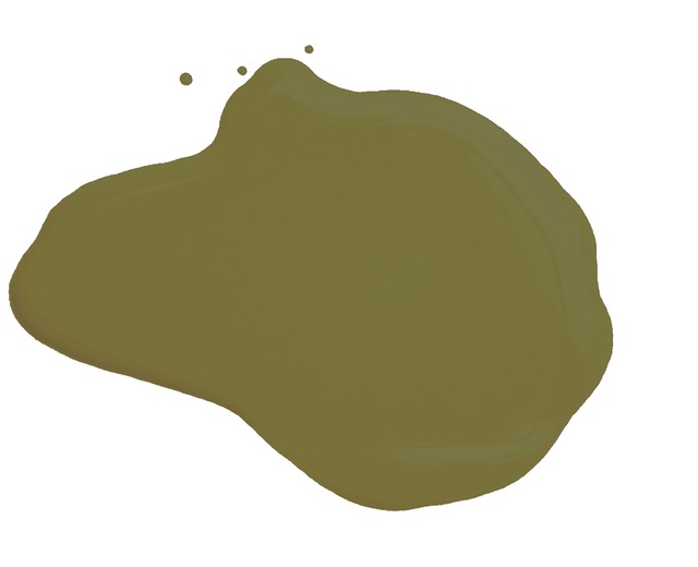
Mata Hari
PPU17-01

Great White
No. 2006

Wimborne White
No. 239

Off-Black
No.57